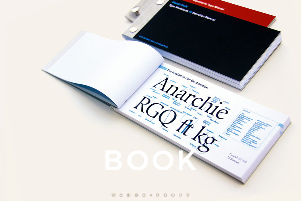
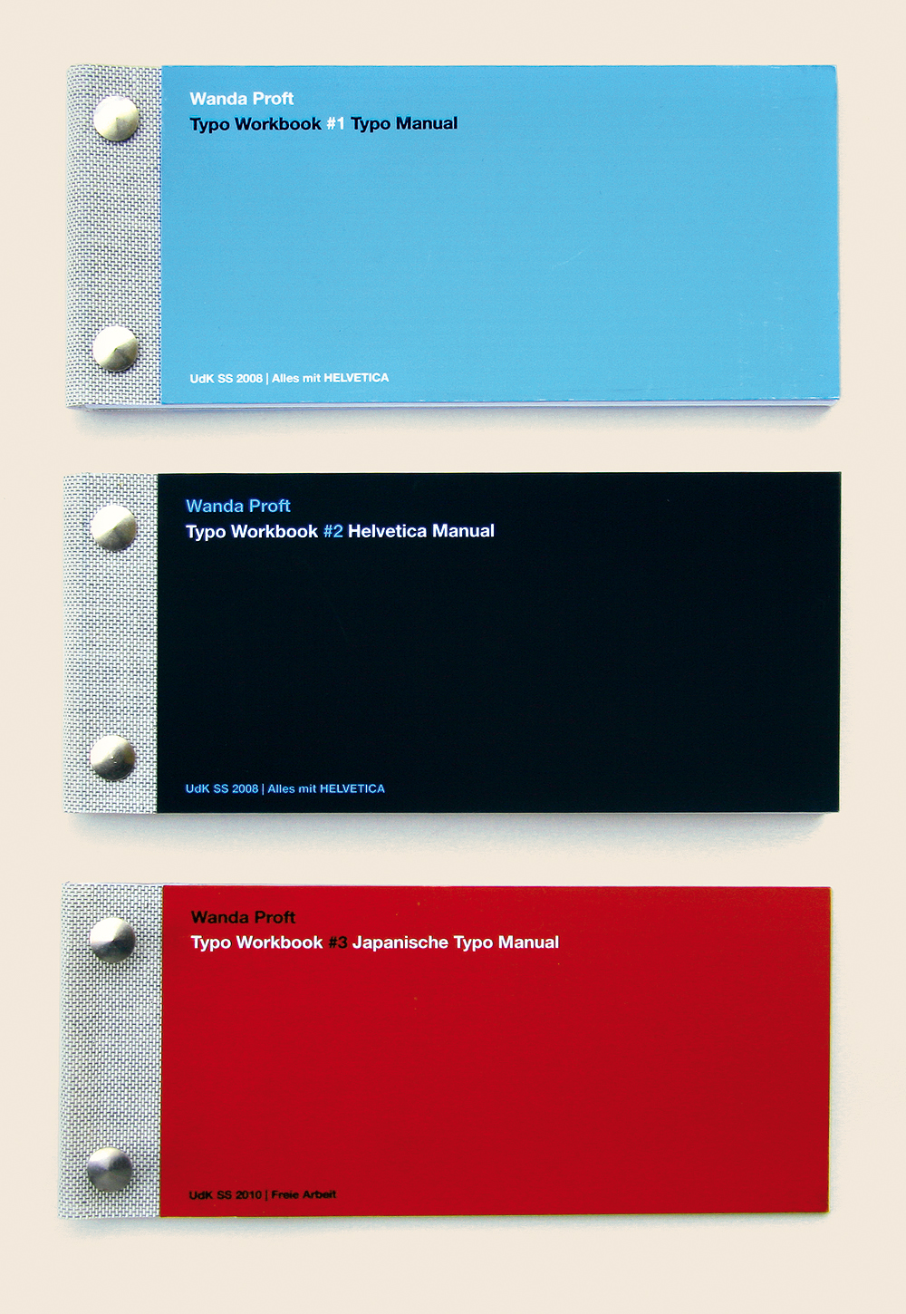
I created the Typo Workbooks as a voluntary side-project to the typography class ›Alles mit HELVETICA‹ (Everything with HELVETICA) at University of the Arts Berlin in Summer 2008. While we were examining the structural and historical features of the famous font, I felt the urge to compile the information we collected in small booklets to be able look up our findings as well as essential typography knowledge easily. Using book screws to bind the pages made it possible to include further information later on.
The first workbook contains an overview of typographical terms and categories. Over the years, it proved to be a handy tool whenever I had to refresh my memory—especially for tasks involving micro typography. All data and discoveries related to the Helvetica itself was collected in the second workbook. This includes a detailed comparison with similar grotesque fonts as well as samples from designer works and class tasks.
In 2010, I started a third workbook focussing on the characteristics of Japanese typography. This already layed the basis for my further, detailed research on this subject in the early years of my study. Unfortunately, though, this third booklet was never completed.
Typo Workbook, Berlin 2008
Nowadays, I still use the first workbook on occasion but its information is largely imprinted on my brain. This shows how valuable extra effort can be. Furthermore, it didn’t occur to me at that time that a ›typo‹ is the word for a typing mistake in the English language. Thus—down to the present day—this project’ book covers are also a reminder of the importance to never stop learning.
……………………
study / University of the Arts Berlin / 2008